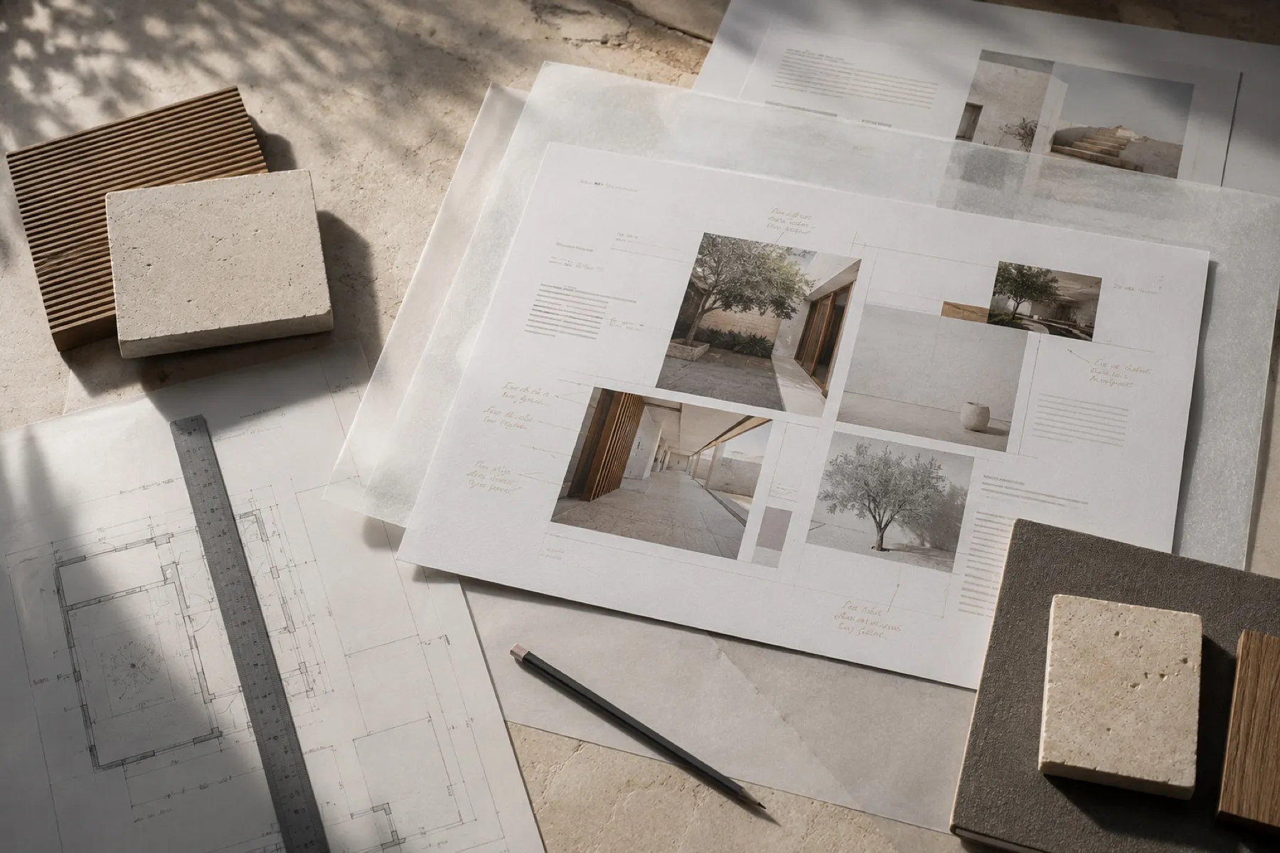
Interior site
Site redesign, service clarity, interior portfolio, mobile experience and CMS setup.
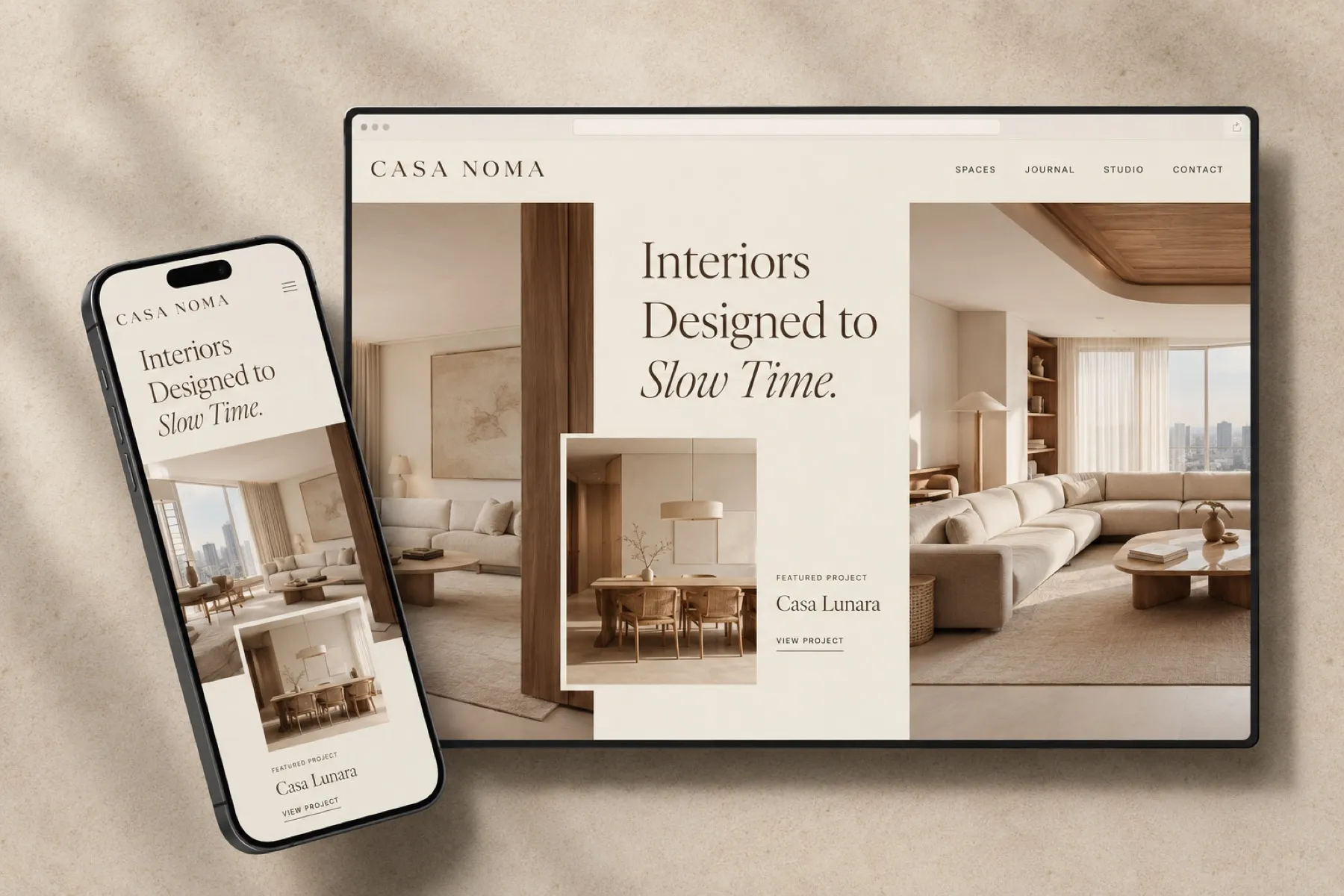
Design decisions.
What we chose for this studio, and why.
Type
Casa Lunara
A classic serif with one italic accent, on “Slow Time.” Small spaced capitals for navigation and labels.
Palette
- Page#EDE4DD
- Linen#D1C1B2
- Travertine#CBBAA8
- Oak#886142
- Ink#27170A
Photographs overlap and step across the grid, like an interiors magazine, instead of sitting in equal boxes.
Location, type, size and year sit in one line under the introduction, readable at a glance.
Travertine, oak and linen are shown as swatches beside the rooms they appear in.