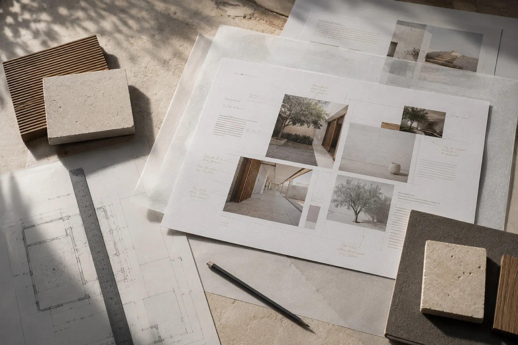
Architecture site
Site redesign, portfolio structure, mobile presentation and contact journey.
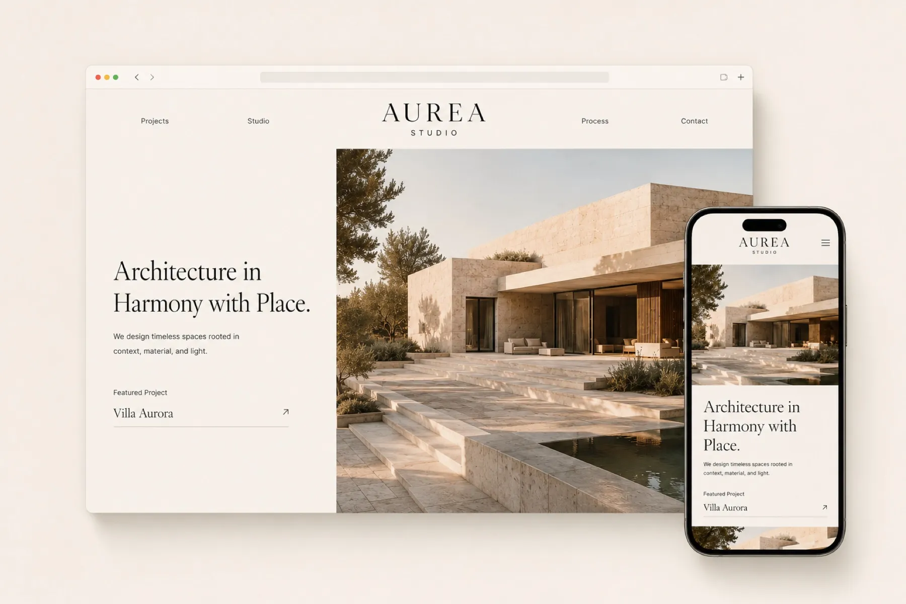
Design decisions.
What we chose for this studio, and why.
Type
Villa Aurora
A light, wide serif for titles. A small sans-serif for text and project facts. Spaced capitals for the logo.
Palette
- Page#F3EEE7
- Travertine#DFCFBF
- Concrete#BBB1A5
- Wood#977657
- Bronze#53412D
- Ink#1C1814
The facts come first. Location, year, typology, size and status sit right under the project title, before any long text.
Materials are shown, not described. Travertine, lime plaster, wood, bronze and concrete appear as samples, the way a client sees them on the studio table.
On the phone, the photograph comes first and the headline follows, so the work is seen before it is explained.